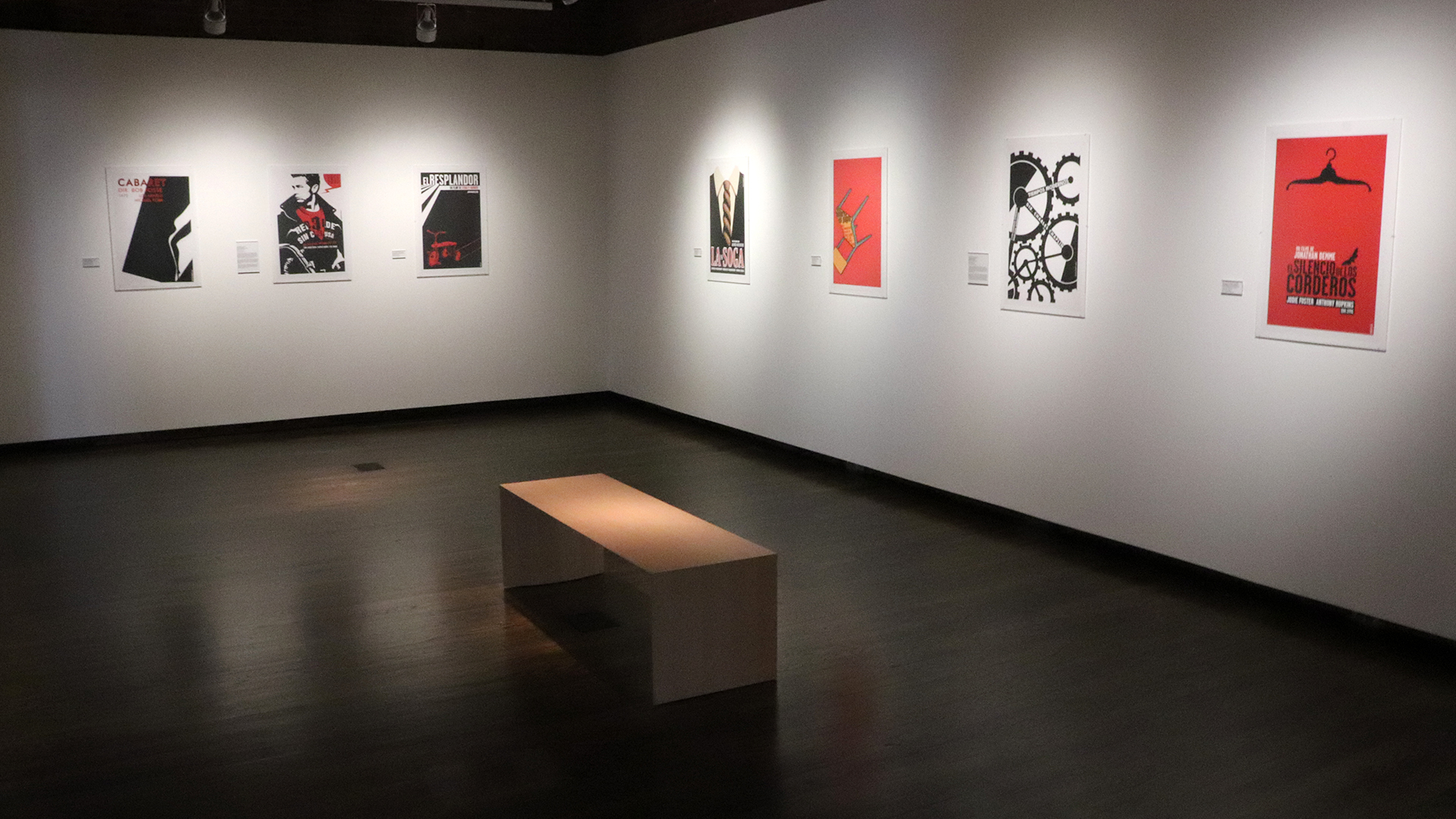
A gallery view of some of the Cuban posters featured in the exhibition Black with a Drop of Red: Contemporary Cuban Posters when it was installed in Mechanical Hall Gallery.
The Power of Posters in the Classroom and the Real World
Article by Allison Ebner | Photo by Sean Diffendall
Posters are a powerful platform for messaging—they market, motivate, educate and inform. They’re also a great way to foster critical engagement with the material highlighted on the poster, making them an excellent learning tool.
During the spring semester, the Library, Museums and Press hosted a movie poster competition in connection with its exhibition Black with a Drop of Red: Contemporary Cuban Posters. Within the exhibition, there were several posters designed by Cuban artists for both American and Cuban films. To parallel those posters, UD students created posters for foreign films using techniques and design approaches they observed within the exhibition.
While the competition was open to all University of Delaware students, several faculty members incorporated it directly into their courses. Students in Professor David Brinley’s Illustration Studio, Professor Colette Gaiter’s The Art of Social Change, and Professor Aaron Terry’s Screen Printing found themselves creating original designs for their class and the contest.
The professors tailored the competition to their course goals with an assignment. In The Art of Social Change, for instance, students selected films that dealt with climate change, a topic of the course, to highlight an issue or call to action. With the exhibition as an extension of the classroom, Professor Gaiter’s students saw how posters could be used as advocacy for ideas or issues. Students in Professor Brinley’s class gained a deeper understanding of how fine art, illustration and graphic design can complement one another; and students in Professor Terry’s class focused on how the process of printmaking can influence design concepts and style.
While each course had its own approach to the assignment, the core of the project remained the same: for students to meaningfully and critically engage with the power of posters by creating one of their own.
Initially, the competition and the assignments were intended to yield printed posters, but as the campus shifted to online learning due to the COVID-19 pandemic, the projects shifted online, too.
Before the quarantine, many students had the opportunity to view the exhibition in person to get inspired.
In Cuba, posters are a major part of visual culture. Distinct in their design from other cultures, Cuban posters emphasize the power of distilled imagery to capture the essence of the represented movie, event or issue. The posters in the exhibition make use of clean lines and stark contrasts to make the designs pop, as well as a striking and simple color palette—black, white and red.

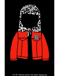
Olivia Jaeger’s prize-winning design for the film Persepolis. Read her artist’s statement here.
Inspired by the Cuban posters, second place winner Olivia Jaeger, who graduated from UD in the spring, kept her design simple by incorporating significant, repeated imagery from the film she watched.
“I wanted to keep it simple and look for one key thing to be the main symbol I used,” Olivia said. The film she chose was Persepolis, an animated film based on the autobiographical graphic novel of the same name that follows a young girl growing up in Iran during the Iranian Revolution of 1979. After watching the film, she had two main designs in mind—the protagonist’s denim jacket and hijab, and a floral staircase. As Olivia moved forward with the former idea, she incorporated the floral symbolism from the latter into the pattern of the hijab. The final project is a thoughtful representation of the many aspects of the film, down to the way she incorporated the directors’ names like subtitles.
The color scheme was another intentional element of design that not only pays homage to the Cuban posters that inspired her but to the film itself. “Thinking with what I learned from the exhibit, I wanted to keep it to a maximum of three colors,” Olivia explained. “So, black and white, because that’s what most of the movie was, and red was the third most important color in the film.”
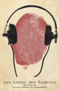
The same principles guided third place winner Makayla Musgrove, who also graduated from UD in the spring, in her poster design for The Lives of Others. The German film is set before the fall of the Berlin Wall and chronicles a member of East Germany’s secret police who is ordered to spy on a playwright and surveil him for potential dissidence to his country.

Makayla Musgrove’s prize-winning design for the film The Lives of Others. Read her artist’s statement here.
The centerpiece of Makayla’s design is a fingerprint, an image found within the movie as well as a visual representation of identity. Rather than a flat, stock image, Makayla painted her own finger to capture a true-to-life fingerprint, complete with uneven ink saturations and other nuances. This level of detail is apparent throughout her entire design. The title and directors’ names are styled to emulate words written on a typewriter, another important symbol within the film. She also stuck to a three-color palette, substituting the white background for a more weathered look to hint at the film being a period piece.
Makayla was committed to digitally mimicking the screen printing effect, as well, which is seen best in the headphones, a symbol of surveillance. “Once we went digital, I still wanted to go for that screen printing look,” she referenced their shift to an online environment. “I manipulated all of the images to look screen printed. I wanted to show that I did learn a lot the short few weeks we were [physically] in class.”
In-person and online critique and feedback from classmates and professors also proved an important aspect of the project in each course. It was through these types of discussions that Makayla was inspired to replicate the imperfections of letters written on a typewriter to make her font more dynamic and to play with her background color to make it more meaningful.
While Makayla, Olivia and the other students who participated in the poster competition didn’t get the experience of creating and submitting a physical poster due to the move online, they still walked away with a valuable experience. They learned how to design a poster, how to use symbolism to express ideas, and how to provide the information people need to know.
Makayla, a pre-veterinary medicine graduate, liked that it pushed her out of her comfort zone. With acrylic and oil painting as hobbies, Makayla is no stranger to art, but she had never participated in an art competition before. She was also unfamiliar with the creativity that can spring from the constructs of an art project or assignment’s guidelines. “It’s fun to get to make something I would never have thought of making before,” she said.
Olivia, who graduated with degrees in chemistry and art conservation, was more familiar with art projects given her training and studies, but found this project to be particularly rewarding.
“I really enjoyed taking what I had learned in art history classes for how to analyze another piece of artwork, and then being able to create something of my own out of that analysis,” Olivia explained. “I did the full circle of studying arts.”
It also brought Olivia full circle with her personal collection of posters. Rather than relying on the imagery alone, she now takes a closer eye to each aspect of her collection. She sees how the various elements—be they shape, color or placement—speak to the artistic detail and meaningful message within. She understands the power of a poster.
Explore the online version of the exhibition Black with a Drop of Red: Contemporary Cuban Posters to learn more about the Cuban artwork that inspired this competition, and to see the competition’s three winning designs and the related artist statements. More online exhibitions are available here.
