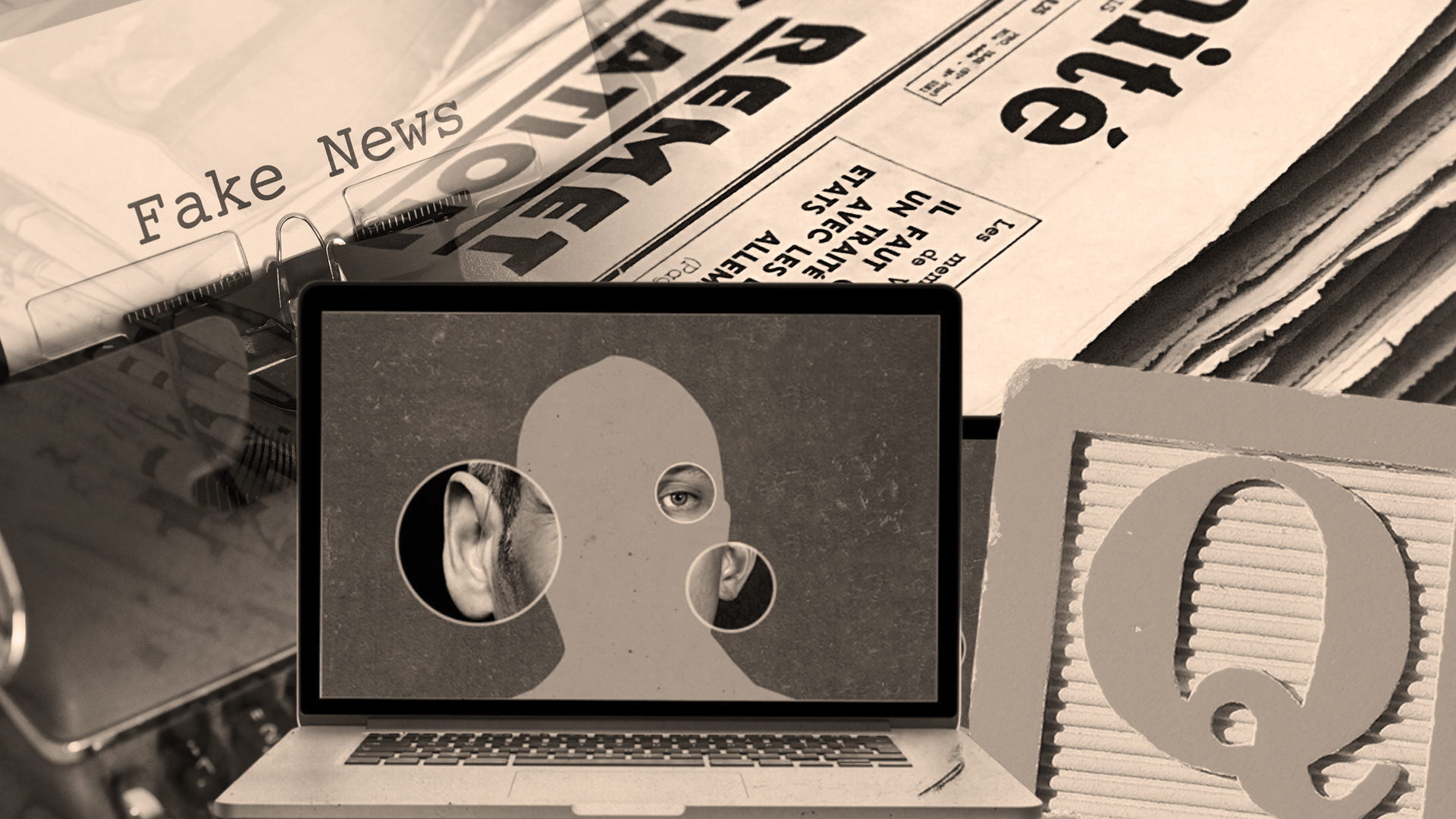
Misinformation, Disinformation or Just Plain Fake: Strategies to Cut Through the Noise
By Meg Grotti, Amanda McCollom, Meghann Matwichuk, Lauren Wallis, Aimee Gee, Alison Wessell and Yuqiao Cao | Graphics by Kris Raser
News stories, images, videos, and data flow into our feeds and impact our own opinions and decision-making in new ways every day. That means misinformation, disinformation, clickbait and errors jostle for our attention alongside exceptional reporting, facts and expert analysis.
It may feel overwhelming and even impossible to sift through these vast streams of information that come at us each day—let alone try to determine if that information is credible—but there’s no need to throw up our hands, cancel our social media accounts and give up.
While it isn’t always easy, there are practices and habits that will help you wade through the noise. Whether you’re engaging with news, images, videos or data, you can build your toolkit to thrive in an often-fraught information landscape.
News
“Fake news” is a real problem. But, in reality, good reporting often has errors, and bad or biased reporting often uses good data and facts. Monitoring your reactions and determining where the information originated are critical first steps to consuming information with care.
Cultivate a practice of slowing down and monitoring how the information you are engaging with is making you feel, and whether or not you are inclined to believe what it is saying. We tend to be far less critical of something we want to believe to begin with, so recognizing up front whether you are leaning toward or away from believing something can help you check your assumptions and engage your critical thinking. To do this, try asking yourself these questions: When was the information—be it an article, an image, a video or a dataset—created, and by whom? What is the point of view, the focus and the central message?
If it’s user-generated content, like on Twitter, check to see if you can discover where the claim originated, or Google the claim to determine if a fact-checking organization has already investigated it. Turn to our Fake News guide for a list of excellent fact-checking sites.
Even if the content is coming from a reputable news source, take a moment to determine if the information in question is a piece of straightforward reporting or an opinion piece.
Images and Videos
The misappropriation of images and videos is a common tactic used by those who spread misinformation. Again, you’ll want to slow down, monitor your reactions, and determine where the content originated.
To help determine the authenticity of an image or video, check for any manipulative strategies and technical changes that may have been applied to the image or video. Has the image been cropped? Has its colors changed? Has it been otherwise manipulated to provoke a certain reaction? If so, it’s a sign the content in question may not be illustrating the whole truth.
You should also take steps to ensure that the image is current to the news story, and not from a different event than what is being discussed. Look for warped and unmatched features or accessories, such as jewelry and eyeglasses, and blurred or repeated elements in facial features or backgrounds. Artificial intelligence (AI) software that creates fake faces generates clues that are easy to spot, once you know what to look for.
In videos, pay attention to details that may seem unnatural. Is the subject blinking in an unusual way? Is there a mismatch between the subject and their background? Does part of the scene seem “pasted on” or out-of-sync? Bad actors with everyday video editing tools or sophisticated AI software can easily edit videos.
It’s a good practice to listen to other parts of an audio track, too. If background noises sound manipulated, that’s a clue something may be off. If the speech sounds unnatural in its timing or if there is an odd pitch or whine, then that may mean the voice has been altered or created by AI. Audio manipulation can literally put words in a subject’s mouth that they may have never said, or make them sound slurred and incoherent.
Data
Data visualizations are vital in helping readers understand complex quantitative information, but they can be easily manipulated to appear to tell a story that is quite different from the data itself.
We’ve come to rely on certain conventions to help us interpret data visualizations correctly—think timelines that progress from left to right and maps that represent greater density with darker shading. Visualizations that don’t follow conventions can confuse and mislead readers.
Be sure to pay attention to the details in data visualizations. Look at the X and Y axes on a graph: Do they start at “0”? Does the scale for X and Y increase proportionally? For pie charts, do the pieces add up to 100? If something is off, the visualization may be misrepresenting the data.
Doing Your Part
Just as we all share the responsibility to limit the spread of COVID-19, we all have a part to play in using and sharing information responsibly.
Even if information seems logical and confirms your own beliefs, if you aren’t sure that the source of the information can be trusted, don’t share it!
Want to take a deeper dive into evaluating information to bust fake news?
- Get hands-on practice cultivating some of these habits and evaluating images, videos and data visualizations during our workshop Learning Beyond Looking: Evaluating Visual Information in Our Daily Lives on April 6 at 1 p.m.
- Discover more strategies to foster critical thinking around misinformation in the news and media with our Fake News research guide.
- Those who teach can chat with a librarian about teaching these concepts in your classroom.
